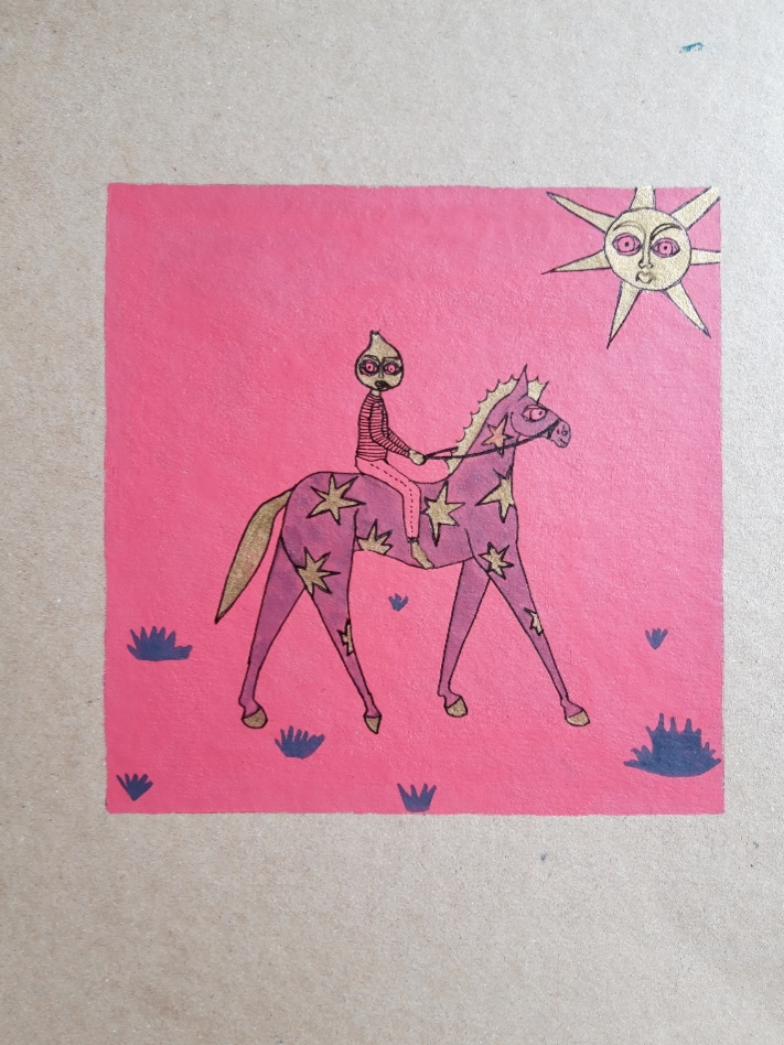
Progressing on from the pen on card illustrations, I wanted to introduce colour into the work. Bold, primary colours to make the drawings stand out against any background, which will be needed within the Southsea Green exhibition as there will be a lot going on surrounding the work. I was also hoping to exhibit some of the pieces within hedgerows and in amongst the allotments, so having contrasting colours will really juxtapose the environment.
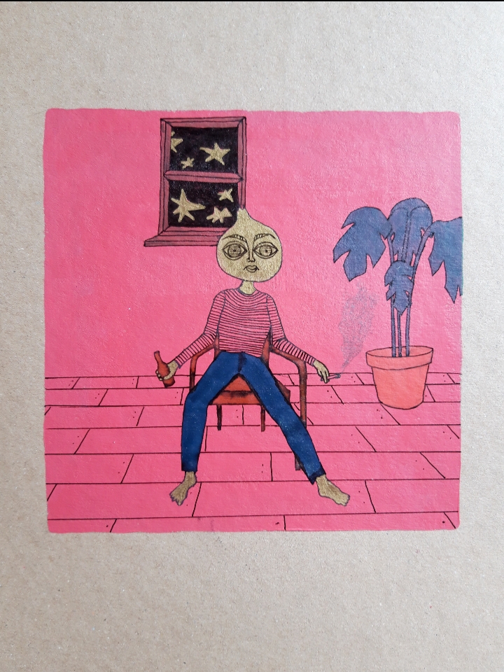
I wanted to introduce bold colours and this shade of pink will contrast the very green aesthetics of the garden space of the exhibition.
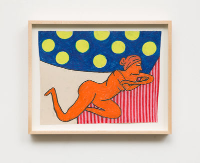
I take inspiration from artists who use a lot of bold colours and simple lines. The juxtaposition of patterns and colours on this piece by Edelhuber has been influential within my use of gold and bright colours that I am starting to introduce into the Onion Illustrations.
